65
design tokens updated
From colors, typography, spacing, and base patterns, we aligned all foundations to Nike’s standards.




Designing Nike’s e-commerce app
experience in Brazil through system
architectureDesigning Nike’s e-commerce
app experience in Brazil through
system architectureDesigning Nike’s e-commerce
app experience in Brazil through
system architecture


Overview
Nike was preparing to launch its official app in Brazil. The existing product had already been designed and implemented, but those interfaces had been created without Motriz, Grupo SBF’s Design System.
When Nike Global reviewed the experience, they identified many issues across visual design, interaction patterns, typography, accessibility and brand consistency.
We had three weeks to get the product aligned with Nike’s standards.
Fixing hundreds of screens one by one didn’t make much sense, especially when many of the problems repeated across the product. So we brought the app into Motriz.
Results
In three weeks, we refactored the foundations of Nike Brazil’s app and prepared the experience for launch.
65
From colors, typography, spacing, and base patterns, we aligned all foundations to Nike’s standards.
+420
Visual and behavioral refinements across the app’s key journeys.
38
The system was extended and adjusted to support Nike’s needs.

Just do it!
We compared Nike’s Podium Design System with Motriz to understand what we could reuse, what needed adaptation and what was missing. That work shaped the Nike theme inside Motriz: typography, colors, spacing, foundations and component behavior. Whenever an existing Motriz component could support Nike’s requirements, we adapted it. When it couldn’t, we extended the system with new variants or components.
With the foundations in place, we started applying Motriz across the existing app. Onboarding, home, search, product pages, cart, checkout and profile were progressively redesigned using the new Nike foundations. The images below show an example of the product before adopting the system, and how the experience changed once those screen-level decisions became shared components, tokens and interaction rules.

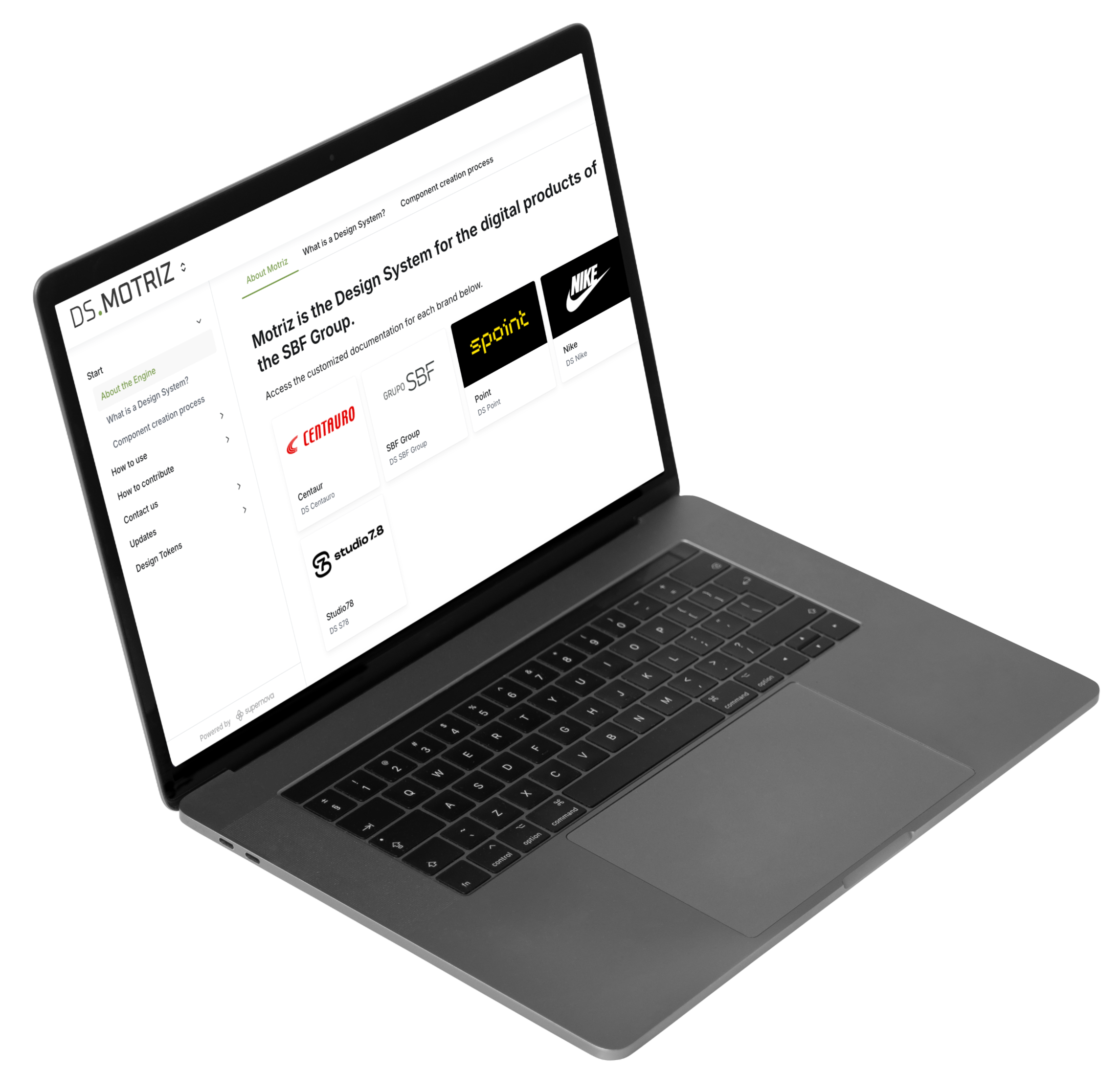
The system also needed to be usable after launch. I created a dedicated Nike section in the Motriz documentation with the foundations and decisions the team would need to keep evolving the product consistently. It covered Nike-specific tokens, typography, colors, icons and brand assets, along with behavior, states, accessibility guidance and content patterns for the 38 refactored components.




Thanks to our design system, we were able to change the game and deliver the entire user journey adapted, with the exact quality and speed the brand needed.
To make this adaptation actually work, the close collaboration with Nike's design team, product, and content design was absolutely essential for us to align together every word, component, and flow to make sure it felt right.
Seeing the app go live with full approval from the brand, followed by great results right in the first few days, was the ultimate validation of our design system's impact, we are definitely ready for the next run!