+85%
prototyping speed
Responsive layouts went from more than one hour to approximately 16 minutes.



Building a scalable multi-brand
Design System for a sports ecosystem
Client
Grupo SBF
Timeline
Oct 2022 → Sep 2024
Scope
Design System, Product Design, Documentation, Governance, Cross-brand Scalability
Team
1 Product Designer, 1 Eng Web / 1 Eng App
Results
Motriz began as an experimental library. Over two years, I helped evolve it into multi-brand, multi-platform product infrastructure connecting Design and Engineering across Grupo SBF. Down below are some of the results we achieve:
+85%
Responsive layouts went from more than one hour to approximately 16 minutes.
+26
Production-ready components built, documented, and aligned with engineering.
-60%
Shared components and token naming reduced design-to-development translation.
100%
All 13 product squads integrated Motriz into their workflows.
7 brands
One shared foundation supported seven distinct brand expressions.
14 apps
Motriz expanded from one desktop product to 14 web and mobile applications
About the company
Grupo SBF is a sports ecosystem formed by Centauro; Fisia, Nike’s exclusive representative and distributor in Brazil; and SBF Ventures, home to NWB, OneFan, X3M, and FitDance. Together, these businesses connect people to sport through retail, digital media, fan experiences, events, and movement.
The challenge
Motriz had been created for a much smaller product context. By the time I took ownership of it, Grupo SBF had changed. The Design System needed to change with it. Four problems became especially important to solve:

Only part of the priority component set was documented, creating implementation gaps and inconsistent usage.

The system was designed around Centauro desktop web and couldn’t support the group’s growing portfolio.

Complex setup and limited flexibility made designers and engineers hesitant to adopt the system.

The core team became progressively smaller while the system had to support more products and squads.
The Strategy
01
Because every brand relied on separate libraries, updates created duplicated work. I introduced a brand-agnostic core connected to semantic and component token layers, allowing teams to change brand expression without rebuilding component structure.
I designed one brand-agnostic core, then used semantic tokens to translate each brand’s visual identity.
All design decisions are stored as raw JSON datasets. By toggling the active brand set within the plugin, the engine applies new values into the visual properties globally, styling the component instantly.
Component attributes never point to primitive hex codes; they inherit from intermediate semantic layers mapped to global primitives.
The final interface uses roles like color.brand.primary instead of fixed values like ”centauro.red”, allowing brand updates to scale without redesigning every screen.
Shared token naming made design decisions easier to translate into production.
02
Motriz 1.0 marked the moment the system moved beyond a collection of Figma assets. Components, foundations, multi-platform patterns and code packages were brought together as one product teams could use and evolve. Design collaboration & video editing: Mateus de Paula
03
I structured the documentation in two layers. The Motriz hub covered shared principles, setup, contribution, releases and tokens, while brand-specific spaces documented their own content, styles and components. The documentation also connected Design and Engineering through references to implementation and live components.
04
A centralized library helped preserve consistency, but relying on the core team for every local need would slow squads down. So I separated the shared production-ready library from local experimentation.
MAINTAINED BY THE DS TEAM

White-label foundations and production-ready components shared across brands.
Validated patterns
Promote to CORE →Local product needs
OWNED WITH PRODUCT SQUADS

A dedicated space for brand and product-specific patterns to be built, tested, and documented
05
With such a lean core team, adoption couldn’t rely on centralized control. I created recurring spaces for critique, support, contribution, communication, and cross-functional collaboration and communication, bringing designers and engineers closer to the system.
Designers reviewed components together before development.
Open sessions gave product teams a recurring space to validate interfaces, clarify documentation, and propose new patterns.
A biweekly Design + Engineering space for exchanging ideas, aligning patterns, and increasing visibility across products and the Design System team.
Regular updates kept teams informed about system changes.
Hands-on sessions helped teams learn Motriz by building with it—not only by reading documentation.
A dedicated channel made support and feedback accessible across squads.
Product Experience
The architecture was used across global brand launches, omnichannel commerce, rapid rebrands and internal tools. Each implementation tested the same idea: shared foundations could support very different product and brand needs without rebuilding the underlying structure.
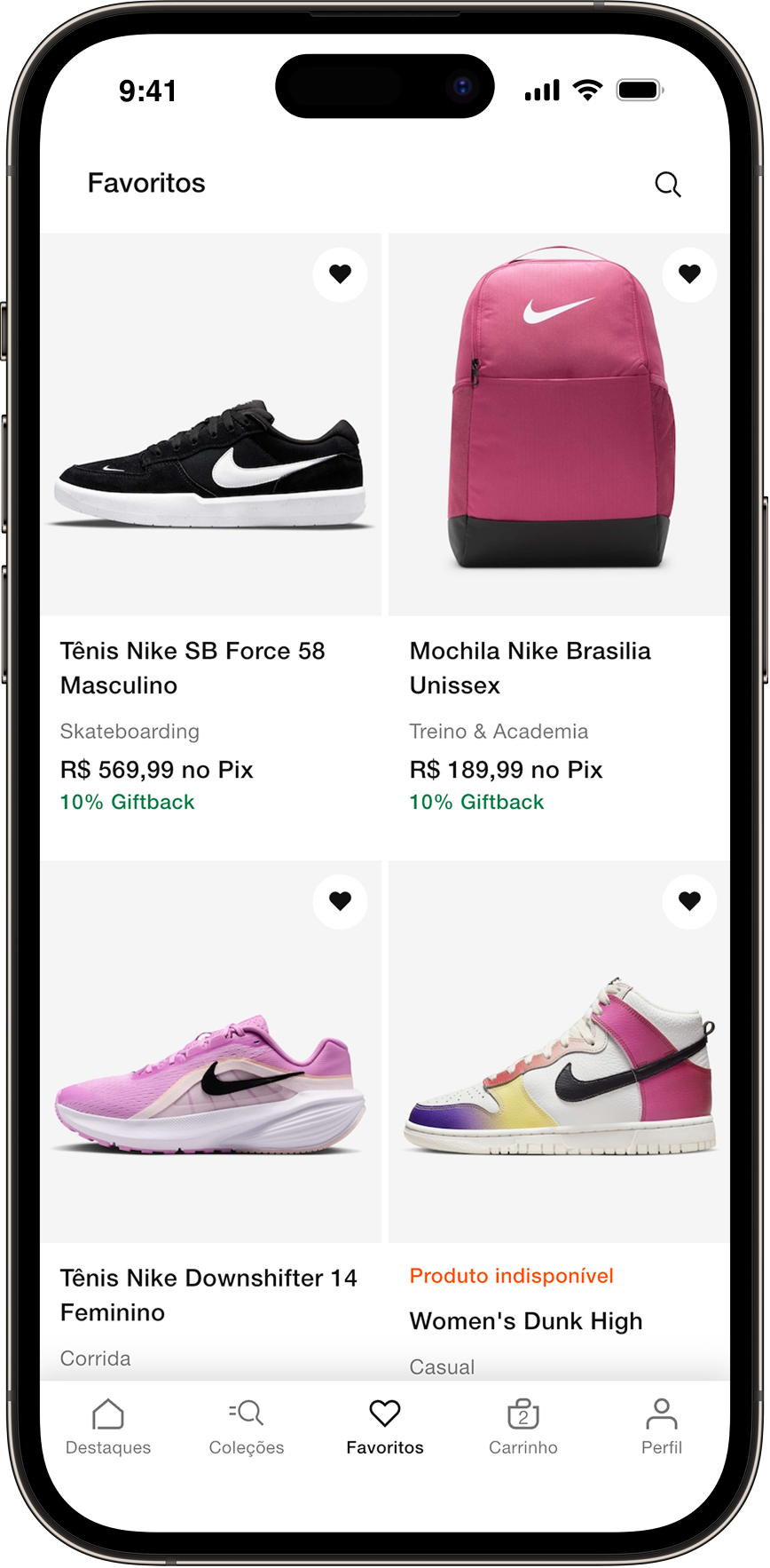
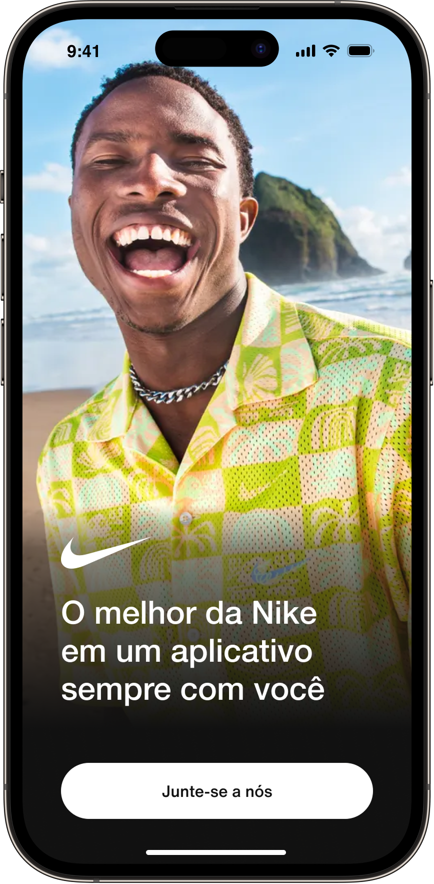
The Nike Brazil app became one of the strongest validations of Motriz’s white-label architecture. The existing Nike interfaces had not been designed with Motriz. We adapted the system’s foundations, tokens and component variants to Nike’s global standards, then used that architecture to redesign the app experience. The result was a native e-commerce product running on the same shared infrastructure used across Grupo SBF.
READ THE FULL NIKE CASE STUDY
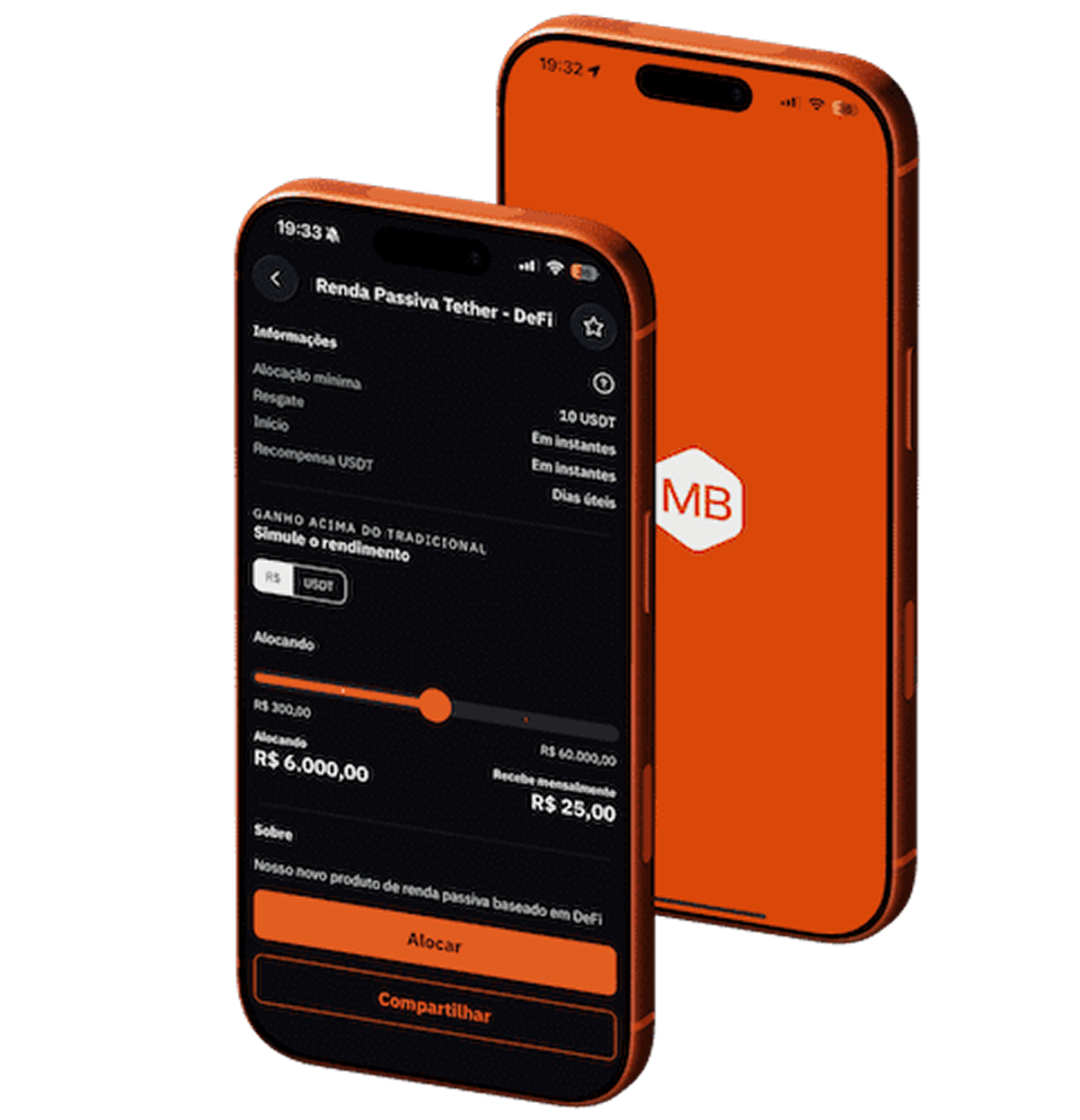
Motriz was integrated across Centauro’s e-commerce main web and mobile journeys, supporting reusable patterns for Product Detail Pages, checkout, search, filters and other high-traffic commerce flows.
When legacy app Crava rebranded to Spoint, we used the token architecture to move quickly from a new brand direction to working product interfaces. I co-created the new visual guidelines and mapped them into Motriz’s token structure. Working closely with Content, we also updated language patterns across the experience. That foundation helped me redesign the app, new features, marketing and transactional communication, and responsive landing pages within a very short timeframe.
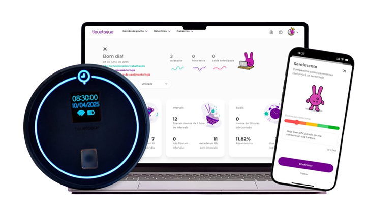
Motriz also powered Painel SBF, an internal platform that centralized pricing, promotions, campaign management, and logistics across the business. By standardizing complex data tables and operational workflows, the system standardized complex data tables, making internal tools easier to maintain and faster to build.
Final Reflections
Working on Motriz changed the scale of the problems I was used to solving. Decisions had to work across brands, platforms and teams, which made me think much more seriously about architecture, scalability and long-term maintainability. It also gave me room to grow beyond my own design work. I mentored designers, facilitated critiques and workshops, and took on more responsibility for how the system was adopted and evolved across teams. Before leaving Grupo SBF, I organized the system’s files and documentation and helped establish shared ownership through a Design Ambassadors initiative, allowing the Design System to keep evolving without depending on one person. I’m especially grateful to Marina Domingues, my Design Manager, for the trust and support throughout this journey; to Mateus de Paula, who worked with me on Design during Motriz’s earlier phase; and to Mateus Vellar and Lucas Falcão, who worked closely with me from the Engineering side.